


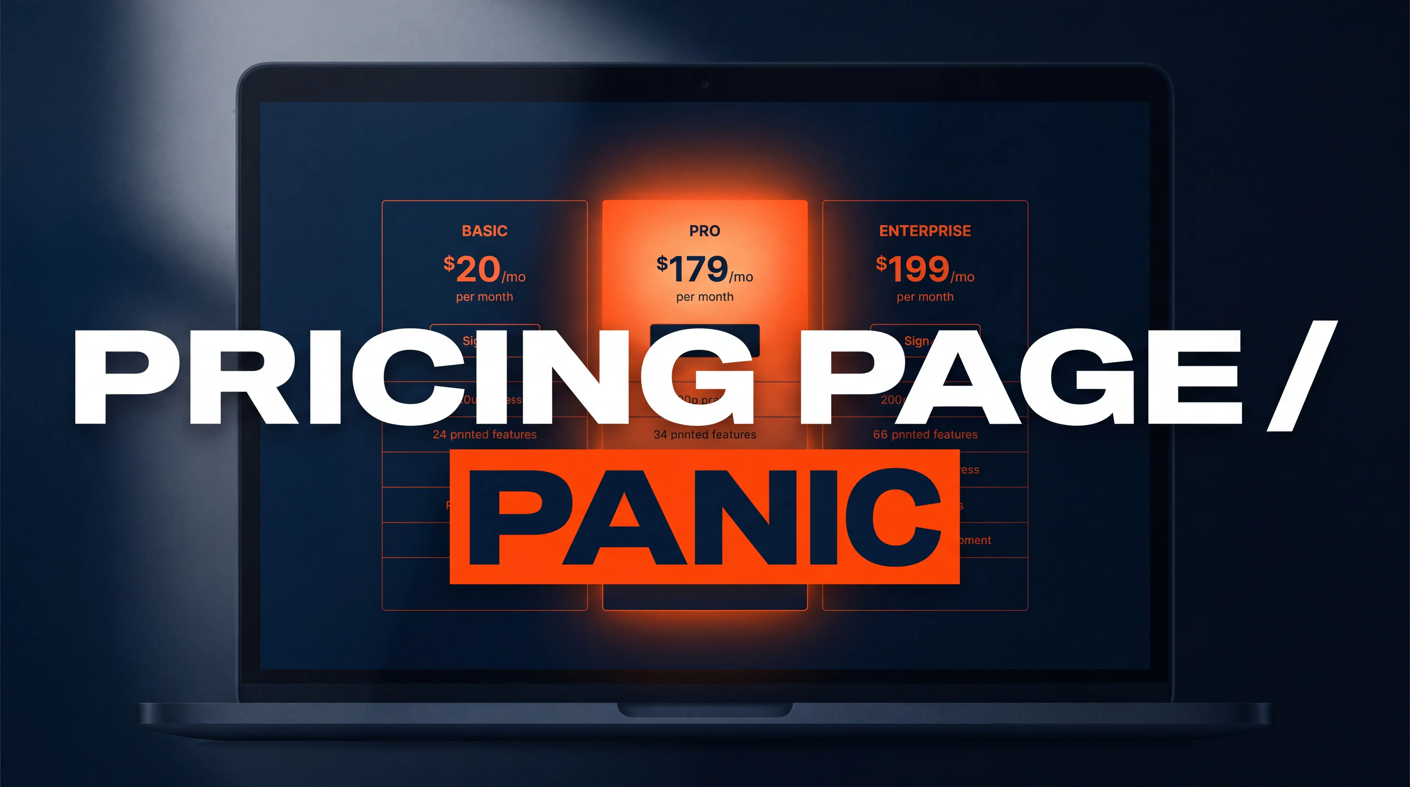
The short answer: what a SaaS pricing page needs
You build a SaaS pricing page that doesn't scare people off by showing transparent pricing, capping the page at three pricing tiers, highlighting one recommended plan, and answering the buyer's risk questions before they have to ask. That is not a style preference. Pages with a visually highlighted recommended tier convert about 22% better than pages without one, and "contact us for pricing" pages carry roughly a 38% higher bounce rate than pages that publish a number. Fear on a pricing page is almost never about the price itself. It is about uncertainty: what happens after I click, what am I locked into, and what will this actually cost me in month seven?
I have rebuilt pricing pages for early-stage SaaS teams and for founders with a few thousand paying users, and the pattern repeats. The product is fine. The positioning is fine. The pricing page is a spreadsheet in a nice font, and it makes people feel like they are about to be charged for something they don't understand yet.
Look at the best SaaS pricing pages you can think of, and you will notice they share a pricing page layout more than they share a pricing strategy. Clear pricing cards, one highlighted plan, short feature rows, proof near the buttons. The pricing works because the page does.
Why do people leave a SaaS pricing page?
Because the page asks them to make a decision before it has given them the information required to make it.
Roughly 57% of SaaS visitors open the pricing page before they have finished reading what the product actually does. Think about that. More than half your prospects are forming a judgment about value with almost no context about the value. So the pricing page is not the last step in your funnel. For a large chunk of traffic, it is the first real step, and it has to carry product explanation, proof, and price at the same time.
Three things reliably cause the exit:
- Sticker shock. The number lands with no frame of reference around it. A $79 per seat plan feels expensive in isolation and cheap next to the $12,000 agency retainer it replaces. If your page never mentions the alternative, the buyer supplies their own comparison, and it is usually "free."
- Decision paralysis. Three-tier pricing pages convert about 31% better than pages carrying four or more tiers. When people cannot tell which plan is for them, they do not pick carefully. They pick nothing, close the tab, and tell themselves they will come back.
- Hidden risk. No cancellation policy, no mention of contracts, no clarity on what happens when they outgrow a tier. Every unanswered question becomes a reason to wait, and "wait" is the default state of a buyer who is not sure.
Those failures are conversion problems, not pricing problems. Same thing shows up on service sites, which is why landing pages stall for reasons that have nothing to do with traffic.
How many pricing tiers should a SaaS pricing page have?
Three, in most cases. Four if one of them is genuinely enterprise and genuinely different.
Tiered pricing is the dominant pricing model in 2026, used by roughly 62% of SaaS companies, and three to four pricing tiers is where conversion peaks. The reason is cognitive, not commercial. Each additional column forces the visitor to run another comparison, and comparison is work. Past a certain point they stop doing the work.
Here is the structure I keep coming back to:
- Tier one is the entry. It should solve one complete problem for one type of user. Not a crippled demo. If your starter plan is obviously useless, buyers assume the middle plan is also missing something, and they hesitate on both.
- Tier two is the answer. This is the plan you actually want people on. Badge it. A "Most Popular" or "Recommended" label on the middle tier can lift conversions into that tier by 25% to 35%, largely because it removes the burden of choosing.
- Tier three is the anchor. Your top tier does not need to sell often. It needs to exist, so that the middle tier reads as reasonable by comparison. When the eye lands on $499 first, $79 stops feeling like a stretch.
Anchoring gets a bad reputation because people abuse it. Used honestly, it is just context. The top tier should be a real plan that real companies buy, with capabilities that justify the gap. If it is a fake number placed there to make the middle look good, sophisticated buyers notice, and you have traded a small conversion lift for a trust problem.
Pro tip: Name your tiers after the customer, not after metals. "Solo," "Growing Team," and "Multi-Location" outperform "Silver," "Gold," and "Platinum," because the buyer can self-select in about two seconds instead of reading three feature lists to figure out which one is them.
Should I show my prices or say "contact sales"?
Show them. Almost always.
Hiding price does two expensive things at once. It raises bounce rate by roughly 38%, and it fills your calendar with calls from people who were never going to afford you. Founders think price gating qualifies leads. In practice it inverts qualification, because the buyers most willing to book a call to find out a number are the ones with the most time and the least budget urgency.
Sticker shock is not a reason to hide the number. Misalignment discovered on the pricing page costs you a bounce. Misalignment discovered on a 30-minute demo costs you the demo, the follow-up, and the reputation hit of feeling like a bait-and-switch. If a prospect expects $500 a month and you start at $5,000, they were never a customer, and both sides are better off learning that in four seconds.
There is one defensible exception. If your deals are genuinely configured per customer, with implementation scope that moves the number by 5x, publish a floor instead of hiding entirely. "Enterprise plans start at $2,400 per month" tells a buyer whether to keep reading. "Contact us" tells them nothing except that you might be expensive.
The same transparency principle applies well outside software, which is why we push service firms toward publishing real starting numbers on their pricing pages too.
Does your pricing model change the page design?
Yes, and this is where a lot of SaaS pricing page design goes wrong. The layout has to match the pricing model behind it.
Tiered pricing is the default for a reason. Three pricing cards side by side, one badged, feature rows underneath. It is the layout buyers have been trained on by every popular SaaS tool they already use, so comprehension is close to instant.
Usage-based pricing breaks that layout. If the bill moves with API calls, seats, contacts, or storage, a static pricing table creates anxiety instead of clarity, because the buyer cannot compute their own cost. Add a pricing calculator with a realistic default, and show what a typical customer at their size actually pays. Then add a spend cap or an alert threshold and say so on the page.
Value-based pricing needs the value stated before the number. If you charge a percentage of recovered revenue or a fee tied to an outcome, the page has to lead with the outcome. Otherwise the number floats with nothing attached to it.
Whichever model you use, the goal is the same: the visitor should be able to predict their invoice. Predictability, not cheapness, is what makes an effective pricing page. A well-designed pricing page for a $400 per month product will out-convert a confusing one for a $40 product almost every time.
What actually belongs on the pricing page layout (beyond the table)
The pricing table is maybe 40% of a pricing page that converts. The rest is the part most SaaS teams skip.
A billing toggle with the math done for them. Monthly and annual, with the annual option showing "billed annually" plus the per-month equivalent. Surfacing annual well can raise revenue per customer by 25% to 30%. Showing a $948 lump sum with no per-month framing does the opposite.
Risk reversal, stated plainly. Cancel anytime. No credit card for the trial. Money back in 30 days. Whatever is true, say it in the buyer's words and put it directly under the buttons, not in a footer nobody scrolls to.
Social proof positioned at the decision point. Customer logos, a short quote from someone on the middle tier, a usage number. Proof placed near the CTA outperforms proof stranded at the bottom of the page, because that is where the hesitation actually happens.
A feature comparison that uses their language. Not your internal feature names. If your dashboard is called "Pulse" internally, the row should say "real-time reporting dashboard," with "Pulse" in parentheses if you must.
An FAQ that handles objections. What happens if I go over my limit? Can I switch plans? Do you charge per seat or per workspace? Every question you answer here is a support ticket you never receive and a checkout you do not lose.
One primary call to action per tier. Not "Start Trial" next to "Book Demo" next to "See Docs." Pick the action you want and make the alternatives visually quieter. If you are still deciding between trial and demo as your main path, that choice deserves its own analysis before you design around it.
Mobile matters more than teams assume here: 58% of SaaS pricing page visits now happen on a phone, and a three-column table that becomes a horizontal scroll on mobile is a conversion leak you can measure. Design the stacked mobile view first, then let it expand on desktop. Broader layout rules for this live in designing pages around a single conversion goal and the six principles of conversion-centered design.
What is a good SaaS pricing page conversion rate?
For most SaaS companies, lead-to-paid conversion runs 3% to 5%, and strong performers reach 10% to 15%. On the pricing page specifically, median conversion sits near 3% to 5% for free trial starts and 2% to 3% for direct paid signups.
Treat those as orientation, not targets. Your number depends on traffic quality more than page quality. A pricing page fed by branded search will convert several times better than the same page fed by cold display traffic, and comparing yourself to a benchmark without segmenting by source produces bad decisions.
What you can control is the delta. A structurally sound pricing page can lift conversion 25% to 30% without touching your ad spend or your product. Documented rebuilds have moved pages from 1.2% to 3.1% and from 0.8% to 3.4%. That is the same traffic and the same product, priced the same way, explained better.
Measure three things and ignore the rest at first: pricing page to signup rate, scroll depth to the FAQ, and tier distribution. If nobody reaches the FAQ, your table is too tall. If 90% of signups land on tier one, your middle tier is not differentiated enough to earn the upgrade.
How your site build affects all of this
A pricing page is the single most iterated page on a SaaS site. You will change it when you reprice, when you add a plan, when you test a badge, when a competitor moves. If every one of those changes requires a developer ticket and a deploy, you will not run the tests, and the page will quietly go stale.
This is the practical case for building the marketing site in Webflow rather than bolting it onto the product codebase. Pricing copy, tier names, feature rows, and FAQ entries become CMS content a marketer edits directly, while page speed and clean markup stay intact for search. We walk through the tradeoff in detail in Webflow versus Next.js for a SaaS marketing site.
Speed is not a side note here either. The pricing page is usually the heaviest page on a SaaS site, loaded with comparison tables, tooltips, logos, and a billing toggle script. Every second of delay taxes a decision the visitor is already nervous about. And because pricing pages attract high-intent search, the technical foundation matters for acquisition as well, which is the ground covered in SEO for SaaS startups on Webflow and the technical debt that quietly caps SaaS organic growth.
The pricing page is also where retention starts. Buyers who choose the wrong tier because the page was unclear are the same buyers who churn in the first quarter, a pattern we broke down in why SaaS users churn in the first 90 days. Clarity up front is cheaper than a win-back campaign later.
A 7-step checklist to rebuild your SaaS pricing page
Steal the structure from real examples rather than from pricing page examples in a design gallery. The best pricing page for your product is the one that answers your buyers' questions in their order.
- Cut to three
- pricing cards, four only if the fourth is genuinely enterprise.Rename tiers after the customer type, not after metals or planets.
- Badge one recommended plan and make it visually taller or brighter than its neighbors.
- Publish a real number, or at minimum a real starting-from floor.
- Add a monthly and annual toggle that shows the per-month equivalent for annual.
- Put risk reversal and one customer quote directly under the buttons.
- Add a 4 to 6 question FAQ covering limits, plan switching, contracts, and cancellation.
Do all seven before you test anything clever. Most pricing page A/B tests fail because the page had structural problems that no button color was going to fix.
Frequently Asked Questions
Should I put a free plan on my pricing page? Only if the free plan has a natural ceiling that a growing user hits. A free tier with no upgrade trigger becomes a permanent parking spot. If you cannot name the moment a free user is forced to decide, run a time-limited trial instead.
Does adding more features to the comparison table help conversions? Usually the opposite. Long feature matrices increase the work required to choose, and work is where buyers quit. Show 6 to 10 differentiating rows above the fold and collapse the exhaustive list behind a "compare all features" expander.
How often should I change my pricing page? Review it quarterly and rebuild it when your ICP shifts, not on a schedule. Constant price changes erode trust with existing customers, but leaving a page untouched for two years while your product doubled in value is leaving money on the table.
Is per-seat or usage-based pricing better for conversion? Per-seat converts faster because buyers can predict the bill. Usage-based monetizes better long term but raises anxiety at signup, so if you use it, add a cost calculator and a spend cap. Predictability is the conversion lever, not the model itself.
Where should the pricing page sit in my navigation? Top level, visible on every page. Burying pricing does not delay the question, it just makes people hunt for the answer, and hunting is friction you are choosing to add.
Ready to fix the page that is costing you signups?
If your pricing page is the last thing you built and the first thing your buyers read, that gap is worth closing this quarter. At Progeektech we design and build SaaS marketing sites in Webflow, optimize the pages that carry conversion weight, and handle the technical and content SEO that brings high-intent traffic to them in the first place. Same product, same price, a page that finally explains both.
Book a Free Growth Call and we will walk your pricing page together, find the three changes with the highest expected lift, and tell you honestly whether the problem is the page or the offer behind it.